Hey guys,
So I started contributing to Duplicati on Github and have knocked out a few small UI issues so far.
I came across this one: https://github.com/duplicati/duplicati/issues/3106
This is an issue that I, myself, have because I like to use very descriptive names in my backups (usually outlining the source and dest in the title) that end up being long.
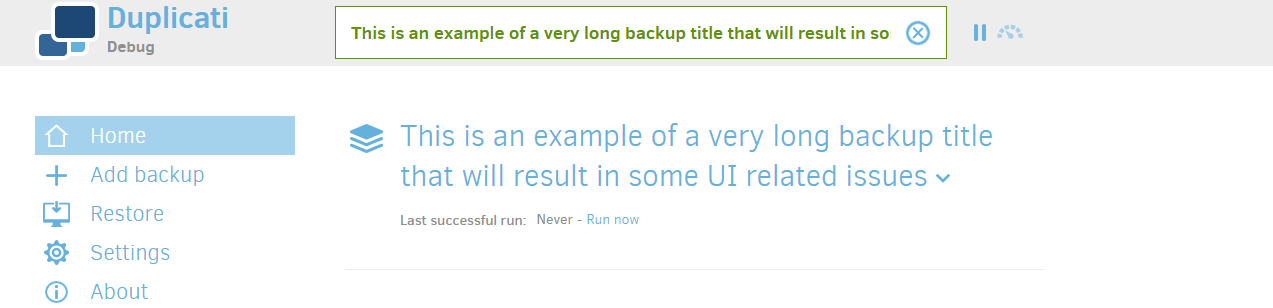
Based on the current way the UI displays the State in the bar, it shows:
[Backup Name]: [Progress]
This looks like this in the UI with a long name:
As you can see… It makes the actual important status info unusable in most cases.
I considered many options and would like to run them by you.
I can simply remove the fixed width that will help make the bar bigger on wider screens. However, this has some negative impacts. It will not be useful for smaller screens with long backup names and also has a tendency to knock out the pause and throttle buttons on the right in certain browser widths.
or
Swap the two items, such that the Progress is shown first and the name second.
It will look like this:
I think number 2 is the better option when considering the long-term value. The most important info (status) is shown first and the backup name is shown second.
In addition, if you would like (and allow me), I would like to include the jQuery Marquee plugin to make the name marquee across the bar while keeping the status always visible, allowing the user to see the full name, regardless of the length.
So:
Backup Status (Still): Backup Name (Marquee right to left)
Please let me know what you guys think.
I would like to implement whichever you think will be a better option.
@JonMikelV - Please Re-categorize if this does not belong here.
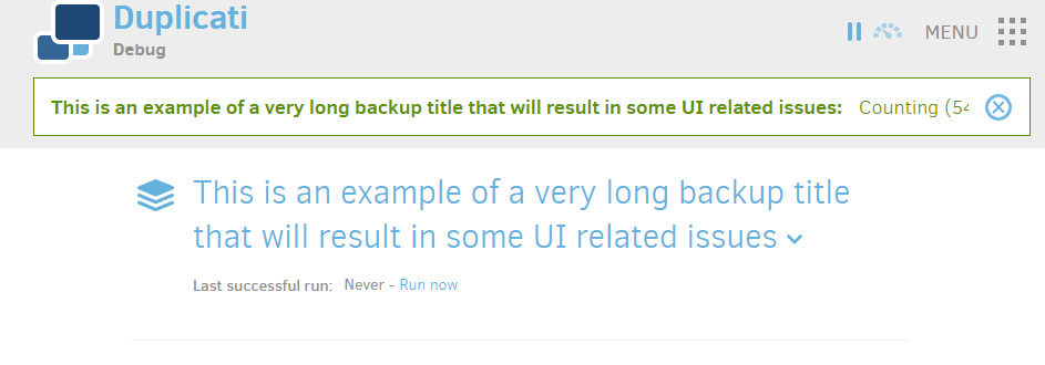
Another option is to truncate the backup name so that it fits exactly in the available horizontal space, like: This is an example of a very long backup title tha… :Counting (301514 files found, 69.53 GB)
Note that you have to take translations into account, some parts (like “Counting”) could have a different length in other languages.
@kees-z -
I like that idea but have one concern. Truncating the backup name does bring up the issue I stated above where very long backup names will not be completely readable for the general user.
My personal user case:
Backup Name:
Important Files - Photos - Rendered to Google Drive - Important
Important Files - Photos - Rendered to Backblaze B2 - Important
So, based on the screen width, It could truncate to something like:
Which would not be very helpful if I had many repetitive names with only a small variation.
I was initially looking to see if Duplicati had a limit on the length of the name, but there does not seem to be one, so it is hard to determine what to do. Don’ t get me wrong. I like that Duplicati does not arbitrarily limit you to a certain length, but I think we should take that into account with the UI.
What about separating the information? My personal UI choice would be something like a status window:
Current Job: (or Next scheduled task)
Myreallylongbackupnameblahblahblahthis-
couldwraptoanotherline

Status:
Counting (201514 files found, 702TB)

Progress:
[---....]
(just a generic progress bar that could be 100% of window width and normalized to whatever that is, or max 300px or something). It’s nice that everything sort of fits in the status bar now but it does completely break on mobile, so having a status box would allow more flexible formatting. When nothing is happening status could be idle and progress would not display.
I don’t think it will make much difference: when using long backup names, the name will be truncated anyway if the status bar has limited or a fixed horizontal space:
It’s impossible to fit everyone’s needs when designing a UI: some people would like to see the complete backup name if possible (your preference), others want to add additional info like transfer speed, resulting in less space for the backup name.
Dynamic icons for the backup job list partially resolves this problem: you can easily identify which backup job is currently running by browsing the list. See issue 3129.
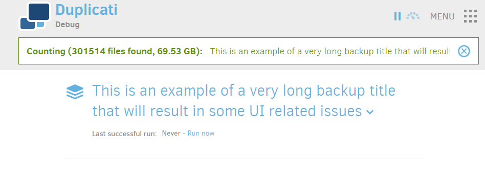
Alright, I will look into the truncating of the title option. I think it will have to be done with JS since the content on the status is dynamic and is continuously changing.
Alright, I have implemented the changes needed to truncate the name and fit the full status. I have also added a title attribute to the name, so if the user hovers over it, the can see the full name in a tooltip
Interesting. I will look into it. I do not have a Mac, so debugging is a bit challenging on that platform. Interesting that there are OS related implications that affect both browsers.
Okay, I will look into it further. I used flex as a fix, so it occurs on the client side without the need for JS, but I will see what I can do. I checked for compatibility before I used it, but it may be conflicting with something else.
Very odd. I can confirm it’s both on firefox and chrome that disabling flex helps.
Curiously it doesn’t seem to matter if I’m on a 2560x1600 screen or a regular 1920x1080 screen, so it would have to be entirely a problem with their implementations on the operating system.
Not that it’s a huge deal, but with Firefox (Windows 10) I noticed the same “: Counting…” right justification that Pectiojin provided a screen shot of earlier.
If it helps any, I just tested 2.0.3.5 canary on a different machine (Windows 10 Pro) and it happened with both Firefox 59.0.2 (64-bit) and Chrome 64.0.3282.140 (32-bit).