Maybe. One of my colleagues were always quick to point out that it only proves I wasn’t crazy in this case, not in general 
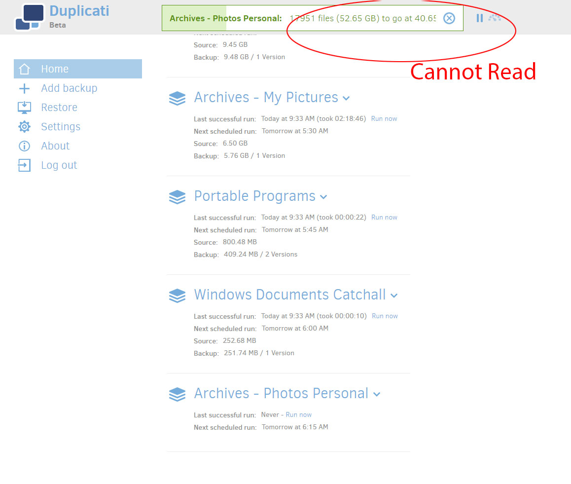
Be nice if the text wrapped, or the font was smaller. Can’t read the current transfer rate sometimes.
Hi @kevin.n, welcome to the forum and thanks for your input!
I’ve moved your post to a topic where issues such as the progress bar with long text blocks have been discussed.
While some improvements have been made, however there are still scenarios where things don’t always fit.
Note that I believe what you SHOULD be seeing an abbreviated job name on the left and the full stats numbers on the right.
What version of Duplicati are you using?
Hi Jon, I’m currently running Duplicati - 2.0.3.3_beta_2018-04-02, and not seeing full stats to the right. The only progress bar or stats I’m seeing is the one in the photo I attached. Sometimes it’s 100% visible but depending on the length of the name selected for the backup, it can sometimes run beyond the space available in the box.
I believe the updates to the progress bar that left justify the job name and right justify the stats were added to version 2.0.3.5 canary.
Note that if you decide to change from the beta channel to the canary channel to resolve this issue, I’d recommend you don’t update past 2.0.3.5 for now as I think some performance issues (and possibly more progress bar problems) were introduced in 2.0.3.6 and 2.0.3.7. Well, that is unless you want to help us debug the source of those new issues. ![]()