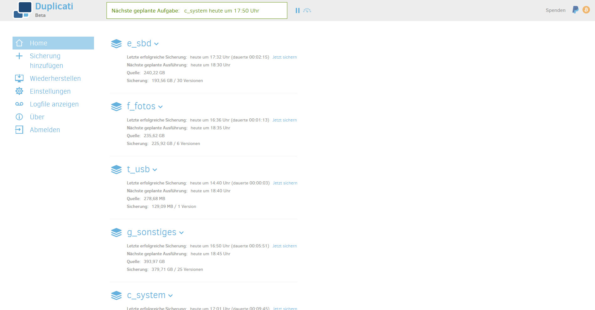
If you do have a lot of space on your screen (especially width), it would be nice if the interface would make use of this.
I specially refer to the “home”-view with the listing of all jobs.
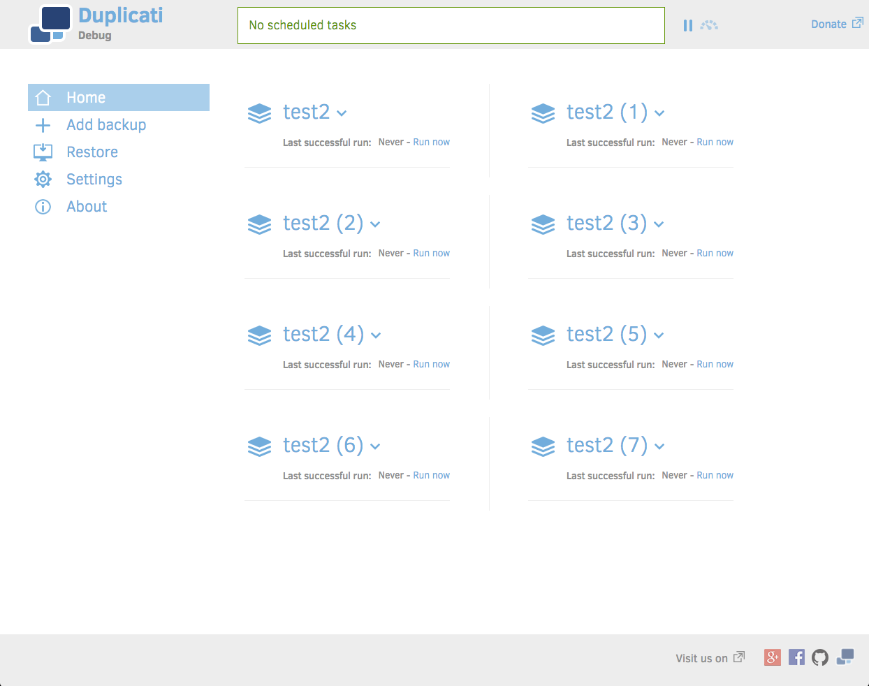
I think, it would be nice to make use of the screen width to minimze scrolling if you do have more jobs in this view. Perhaps a 2 or even 3 column view? Something like this:
Nice!
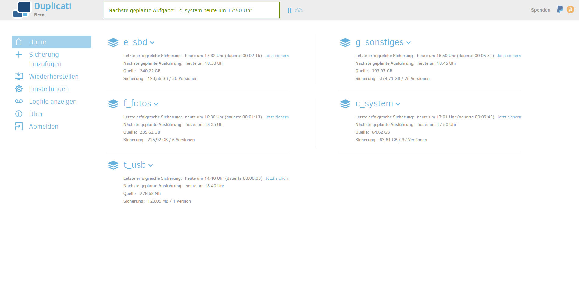
2 columns should be enough for me.
If a backup has run at least once, more horizontal space is needed. There should be enough white space between the columns, so I assume 2 columns should use most empty space on regular resolutions.
I would consider making it with a wide list area, and then use flow: left such that each div encapsulating the backup data will “float” to the next line, automatically making it adapt to any width.
But if you have it working for two columns with odd/even, we can do that and see if there are people with really wide screens :).
I’m not familiar with flow. Would that still allow vertical scrolling? I wanted to make columns but still scroll vertically if there isn’t space for all the jobs on 2 columns
It’s a bit strange. The foldout is wider than the div containing it and when I made it shorter to fit inside the parent div it changed spacing between the two columns.
I had to take a break last night, but I’m sure there is a solution, I just have to find it
Or perhaps some abuse of zindex or just a plain old “modal” style window for job details (most of the links do a page reload anyway). Though that opens up annoyances with window centering etc.
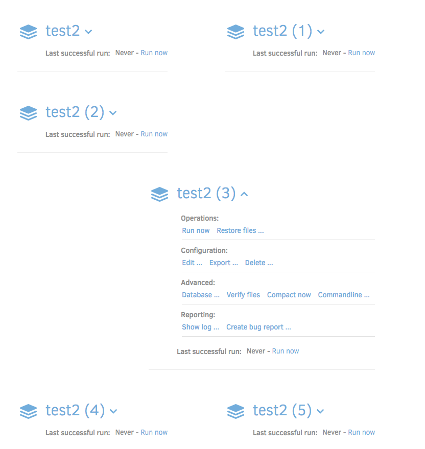
Well noticed. Backup job list should have a clean look, with or without any job unfolded. Thinking about it, I ask myself some questions:
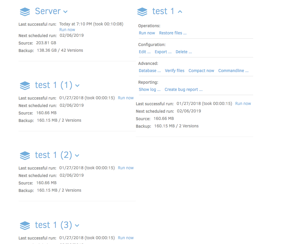
Backup names and statistics have variable lengths. This can cause a line wrap if the column doesn’t have enough horizontal space. Example: the first backup job (Server) in your screenshot has the “Run now” link on a new line, causing the horizontal line to be out of sync with the column at the right.
I think horizontal separator lines should always be aligned with lines in columns next to it. This could be fixed by making the columns wider, so that all information fits on a single line in all circumstances. Backups with very long names could be truncated and optionally the “run now” link could be replaced with a small triangle icon (Play button) next to the backup name.
When expanding a backup job in column 1, how should the backup list in column 2 behave? My personal preference is that the backup jobs in all columns move down along with the expanded backup job, keeping all backup jobs aligned properly.
What is the best order for the list of backup jobs? Fill column 1 with the first part and add the last backup jobs to column 2? Or distribute them horizontally, keeping the first jobs at the top of the screen?
There is a feature request for (manually) reorder the list of backup jobs. Will using multiple columns prevent implementing this feature? Reordering the list could be achieved by drag and drop, or a button that opens a list with backup names only that can be prioritized.
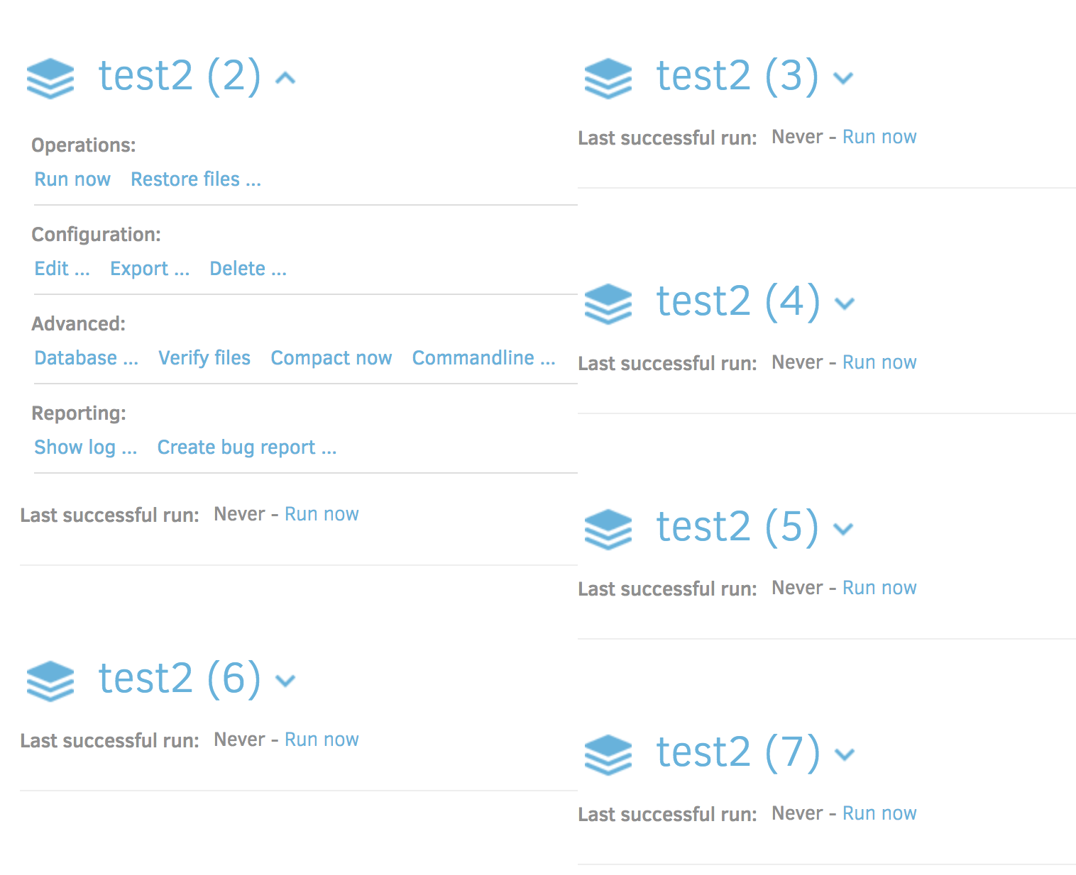
Using drop down menus instead of expanding jobs can help with horizontally aligning of backup jobs. If jobs don’t expand by clicking on the name, it’s easier to force a preset number of lines for all backup jobs. An example how it can look can be found here:
It should be noted I tweaked the max width of each unfolded column, making it shorter. I couldn’t make them wider because that won’t fit on the smallest full size screens (1250 pixels wide before table/mobile css kicks in).
I’m not sure. Currently it’s just listed left to right repeating on each row because that’s how it worked out with Even/Odd classes.
It might actually make it more complicated. Most list ordering tools I’ve seen for Javascript only work for single column/row lists.
What also really bothers me is that expanding a job can push some of the jobs in one column over to the other column while it’s open. Then the order is suddenly changes
Drop downs could make this easy. However, drop downs can also be uncomfortable to use if you have to repeatedly click into it and locate the correct option.
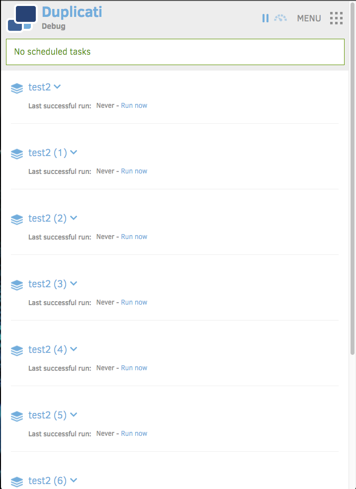
Try resizing the window so the boxes do not fit, and they flow down instead of left. You can force two-column by setting clear: both; on the odd items. By default it will allow “as many as possible”.
The flow should actually fix it, but the menu expand might look weird.