It must be a good idea if everyone keeps linking to it 
We could also opt for a plex style display of jobs.
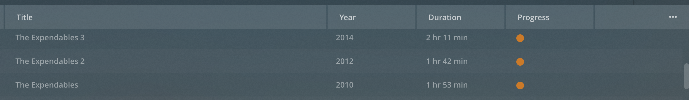
Throwing it in a table minimizing the horizontal space usage while getting a ton of flexible width. We could have columns like this:

Then a couple of buttons and a fold out menu at the end of each column the same way Plex does, which is very easy to use and which is still the same number of clicks away as expanding a job, but perhaps with
edit and run now displayed on the bar for easier access.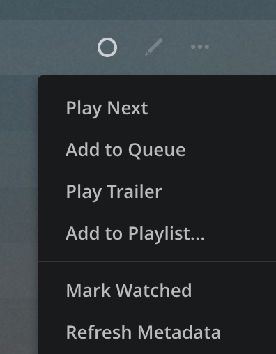
Although this would have it’s downsides on mobile where each line essentially would have to be a fold out with the info that doesn’t fit in the row… Why is UX so hard?
I like the column idea, but then I like seeing lots of data at once. For new / non-techie users it could be intimidating.
Let’s just implement a “themes” system and let people use / submit their own designs.
2 Likes
We should take the Arch Linux approach and have people make their own UI before they can start using Duplicati. That way it’ll be less bloated and be just the way they like it
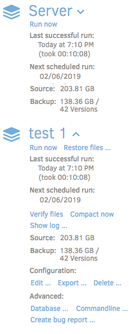
To be honest, I don’t like the table view. It will break the (for me) biggest advantages of the current design:
- big font for menu options and backup names for easy identification on large screens.
- responsive design, very usable on mobile devices.
The table shows lots of information using a small font. Your eyes have to scan the whole screen to find out which item in the Versions column belongs to a certain job name. In the current design, you find a backup job quick and easy with basic information just below it.
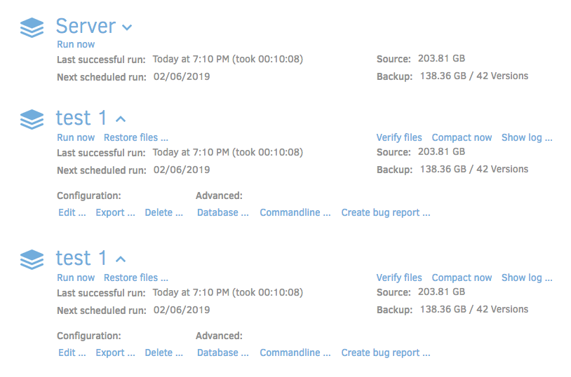
If you have just one or 2 backup jobs, you will fill up most horizontal space, but almost no available vertical space, resulting in lots of information on 1 or 2 lines on a further almost empty screen.
I prefer optimization in details of the current design instead of a complete makeover.
(UX isn’t that difficult. Just create 200000 different themes to serve 200000 users.)
Agreed. But GOOD UX is. ![]()
I mostly agree. It was kind of just to toss it out there trying to be creative with the design by knocking over some walls.
I’ve been having a lot of trouble reconciling the column idea into an actual useable implementation that actually feels like a step up from the existing layout. The existing layout works for me. I only have 2-4 backups on a system, which fits perfectly on all screens. But I could see it being tiresome for someone with more. Maybe this is partially addressed by allowing reordering of jobs?
I think the “block” model with some exposed information and a fold out page works well. However this may change once we start thinking about cramming more features in, like all the good ideas discussed on
Make status bar a link to backup - #5 by kees-z, adding queue information, and options for run now, queue next, queue next, etc.
I wish I had thought of that ![]()
Omit the smiley, I think this is actually a good idea. There could be plenty of reasons to make changes to the user interface: people don’t like the color scheme (an alternative color scheme had been added to the settings page already for this reason), want to hide or change information, add a company logo, and so on.
I know there are options to change/brand the Duplicati package using the OEM folder, but a tool to customize the user interface could be useful for lots of users. However, I don’t see this to be something that needs to be developed in the short term, maybe something for after a stable version has been released.
I think so too - but I also think it would likely involve a huge rewrite of the GUI and some serious time put into designing it to be theme-able. Personally, I’d rather see functionality improved before interface.
1 Like
Agreed 100%. Like I said: not something for the near future. Bug fixing, improving speed and stability first.
That’s another valid point to consider. If it turns out only 1% of users have more than 2 jobs then how much effort should be put into designing an infinitely adjustable interface?
It might also be worth determining WHY people have so many jobs (and why they might be wanting to re-order them, while we’re at it).
For some it might be performance (database gets too big then slows down) which could be resolved with backend improvements.
For others it might be wanting on and offsite backups which could be resolved with a redesign that supports multiple destinations for a single job.
For me, I’ve got lots of jobs because I’m often making test jobs to try and recreate another user’s failure scenario. My laziness in not deleting them once the issue is resolved is probably not a good reason to spend a bunch of time designing a new UX.
Good UX can’t be that difficult. I just designed a great looking table theme using Markdown in a text editor! Come to think of it, maybe I just think it looks good because I spend every day looking at mono-spaced text in 4 colors in a terminal or text editor… ![]()
I make all my tests by booting Duplicati in Xamarin studio to keep the clutter out of my actual backups. Also works nice for replicating their exact version if it’s necessary ![]()
Laziness is always a good reason
All kidding aside, I think we will need to redesign it eventually. But I think the right design will be more easy to discover once we cram enough functionality into it. I have some dreams of using some of that glorious database data for some visualizations of the backups and allowing users to actually monitor and manage whats in their backup. This is already possible in the CLI but it won’t fit on the web UI right now ![]()
I think I’ll torture myself a bit more with trying to get multi column design to work well. It’s a good idea that doesn’t mess with the current design ideals but still adds value. I’ve been relying mostly on css, but perhaps I can’t get around putting some more html in there.
1 Like
<table> for the win!
I was certain we killed off tables for non-tabular data 6 years ago when I worked as a web developer… Battles were fought, blood was spilled, and loved ones were lost… 
I’m throwing it all out and building an index.html page from scratch with bootstrap. They have some good css for doing table-like stuff with just divs. Then I can probably figure out what structure and css is needed and transfer it over to the application.
3 Likes
“Responsive” just means it does something different and responds to differing situations. The key is to make it respond in an appropriate manner. While all of the above options have logical merit to them, I would like to suggest a different way to be responsive with that space.
Having multiple columns of the same data tends to make quickly visually finding data more cumbersome than an ordered list, especially once scrolling is involved. As such, make each details area go wider to fill the space, so it still reads like a list with larger headers for job names, but the details can spread across (more like the table style) to make use of the screen space, but not clutter up or make the main details harder to read. This would also work well with expanding to more details, as all it has to do is add vertical space and more lines of details as required.
On the html/css side to make this happen, all that is likely needed (sorry, haven’t dug into the code yet, so giant assumptions exist here) is to adjust the flow/alignment/width/scale of the divs or spans that make up the more detailed text, based on available width.
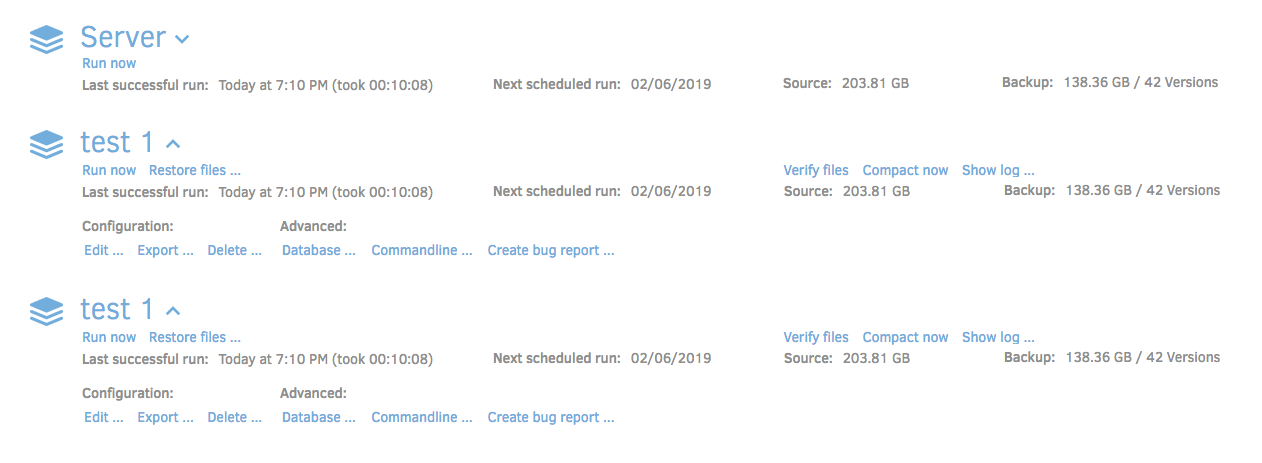
I’m attaching some quickly whipped up photoshop mockups for the widths that includes design space between the basic stats and advanced options for allowing the status bar being discussed in other UX/Feature requests (but doesn’t show it). It does move and re-arrange some of the action text though, which I don’t know if is easy to do or if it comes in blocks in the order displayed from the back end.

2 Likes
Do we need a bug made for this on github (as I didn’t notice one checking the recent ones since this thread started), or is this post enough and being tracked in a similar manner? Not completely sure of the duplicati process for that.
Keeping it either here or in GitHub works. GitHub might be easier to keep track of but “the official way” is whatever way gets developer attention 