Backup set quick-link icons

It seems to me my backup names are generally much shorter than the width of the backup summary text. Would it make sens to include some “shortcut” icons to frequently used “sub-menu” items such as “Edit”, “Verify”, and “Show log” (and maybe move or duplicate “Run Now”, just for consistency?

Of course I realize not everybody will have short names, so another thing to consider is all the vertical white-space below the icon the LEFT of the backup name - perhaps shortcut icons could go there… :slight_smile:

1 Like

I think it sounds good. But I am terrible at UI design, so I would need some mockups to move on something like this.

A few things to consider:

  • Adding icons assuming a short backup description doesn’t sound like a very good idea to me.
  • Adding a set of icons to every backup job may ook messy.
  • Which items are used frequently and which are not is quite subjective
  • An icon in the main interface may cause starting unintended operations (clicking a Verify or Run now icon accidentally may cause an unwanted, time consuming operation).

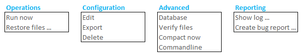
In the current web interface, a click on the backup name shows all options at once. Splitting the main options (Operations, Configuration, Advanced, Reporting) to individual drop down menus could result in a more clear interface, resulting in easier/quicker navigation, with the same number of mouse clicks.

The interface could be changed to something like this:

image

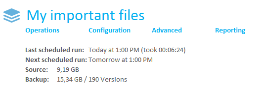
Clicking on one of the options (Operations, Configuration, Advanced, Reporting) opens one of the drop-down menus:

image

1 Like

It’s a nice layout but it doesn’t make getting to any specific function any faster (and actually makes Run Now one level deeper). Would you see the responsive version of that something like this?
image

I know UI work is tough to do and very subjective, I don’t suppose there’s any reported logging of what interface items are actually used in the real world?

Rather than a “major” redesign some simple things could be tried. For example, I’d do something like the following that the keeps the current submenu but pulls useful tasks into the vertical whitespace next to “related” items:
image

I would also also show the “Next scheduled run:” line so “No schedule set” could be shown instead of having to dig into Edit to know that (with side benefit of “run now” being always visible in it’s new location).

Oh, wait - I bet that won’t work at all in other languages. Perhaps icons with tooltips would be better… :slight_smile:

It doesn’t make it faster in number of mouse clicks (only 2 clicks, can be improved with max 1 click), but gives a more clean look which makes locating what you are looking for easier and thus probably faster. If the pull-down menus automatically open when hovering over the links, all items could be reached with a single mouse click.
Putting the Run now link under the Operations menu will again give the UI a cleaner look and (more important for me) avoids accidentally starting a backup with an unintended click on the link.

My opinion: less clean look (too many functions in a too small area in a too small font for easy navigation). Also each backup job will take up 4 extra lines of space. With a larger amount of backup jobs the list will become longer than needed, which gives it - again - a less cleaner look.

Can’t agree more with that!
The fact that it is not known which items are most wanted makes it tricky to pick a few direct links from the available options and will make it less intuitive (if there’s a quick-link, should it be added in the “normal” menu? Will users actually find additional menu options by clicking on the backup name?).

My personal view: again, too many options in a too small area in a too small font, too close to the information at the right side from it.

Good idea! Never noticed the line is omitted if no schedule is defined.

This could indeed be a problem because translated text might not fit in the small area. But a bunch of small icond below the main backup icon would still result in a messy look.

1 Like

If I got the urge to look into the page design and fiddle with it…

Is \Program Files\Duplicati 2\webroot\ngax\styles\style.css generated by some tool you use?
The items we are talking about is C:\Program Files\Duplicati 2\webroot\ngax\templates\home.html I suppose

Maybe I should just leave it alone :grin:

Yes, it is generated by less (source files in the less folder), you can build it with something like:

lessc style.less --clean-css > ../styles/style.css