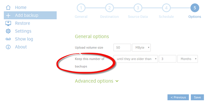
Confusing wording: "Keep this number of backups"

I have done this before (some time ago), but when I was now setting up a new backup job, I got stuck with this (this is the default view, I didn’t touch anything):

“Keep this number of backups” doesn’t make sense as an option when it doesn’t give you the possibility to actually enter a number.

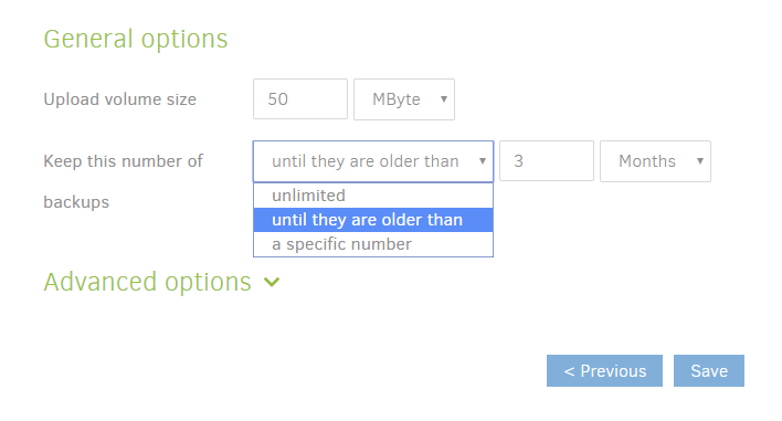
If you’re not like me who stares at that screen for about 10 minutes, reading it over and over again, trying to understand what it means, you might eventually discover this:

^

And if you click on “a specific number”, you will finally be able to enter that number. But even then, the wording will be rather strange: “Keep this number of backups a specific number 4”

Anyway, you get the point. I’d like to suggest to call this option something like

“I want to retain backups” (i.e. replace “Keep this number of backups” with “I want to retain backups”)

and change the items in the dropdown menu as follows:

“unlimited” -> “without limitation” - perhaps add something like: “(backup storage will grow infinitely)”
“until they are older that” -> no change
“a specific number” -> "up to a maximum number of "

The UI can probably be improved more, but I think this would be the easiest and fastest change. What it doesn’t solve is the problem that you still need to understand what a backup exactly is here (I know the answer is here on the forum, but I wont look for it now), but that can probably not be explained in the UI anyway.

Edit:
Here is an alternative suggestion:

“Keep this number of backups” -> “Backup retention”
“unlimited” -> “unlimited (keep all backups for ever)”
“until they are older that” -> “keep backups until they are older than”
“a specific number” -> “Keep this number of backups”
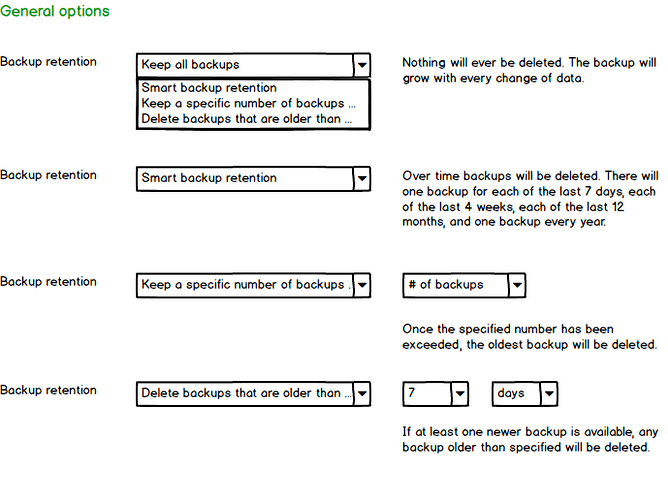
I just saw that @renestach proposed an even better UI for when “Smart backup retention” becomes available. Here is his mockup from Github:

I like it very much, but I’m not sure when Smart backup retention will become available. It seems to be available in the canary version as an advanced option --retention-policy, but even if that makes it into beta soon, the UI changes will probably take some extra time, so I would still suggest to implement the proposed rewording as a quick fix.

I agree, except that your proposed rewording is too long. The width of the pull-down menu would be too large to fit all text nicely on for example a mobile device.

Granted. But probably still better than the current state, no? (What good is it if the displayed options fit on your screen if they are incomprehensible.) And running duplicati on mobile is perhaps also more of an edge case…

For me it’s fine the way it is now, but maybe I’m a bit too well-informed. :wink:
The Web UI has a nice design that works too on screens with a lower resolution. Destroying the current responsive design doesn’t sound like a good idea to me.
Personally, I check the backup results regularly from my mobile Phone, so I don’t see this as an edge case.

Sometimes we have to accept that we’re a bit out of the ordinary :nerd_face:

But even if not, checking your backup results will remain the same. It’s only when you want to setup or modify a backup, when this would become relevant on mobile.

As the author of the duplicati manual, even that is something of an understatement :wink: So when it comes to representing users who just want to set up some backups in as little time as possible, I am the authority here :stuck_out_tongue_winking_eye: and I say: this would be a huge improvement:

BTW, as I look at it: the suggested texts are not really that much wider than what they are now. If width is really an issue (have you tried it?), here is a shorter version:

“Keep this number of backups” -> “Backup retention”
“unlimited” -> “unlimited (keep all for ever)”
“until they are older that” -> “keep until backups are older than” (or: “delete when older than”)
“a specific number” -> “Keep this number of backups”