We would like to introduce a visible backup queue and we would like to improve the notifications.
Summary
To keep the UI clean and tidy, we separate different things from each other in the UI. So, we get
Backups
Queue
Notifications
Settings
Backup
On the screen"Backup" you can add backups, start a restore procedure, edit existing backup, and run them. This is pretty much the same functionality as Duplicati has right now. We just moved around the buttons a bit and removed the progress bar.
Queue
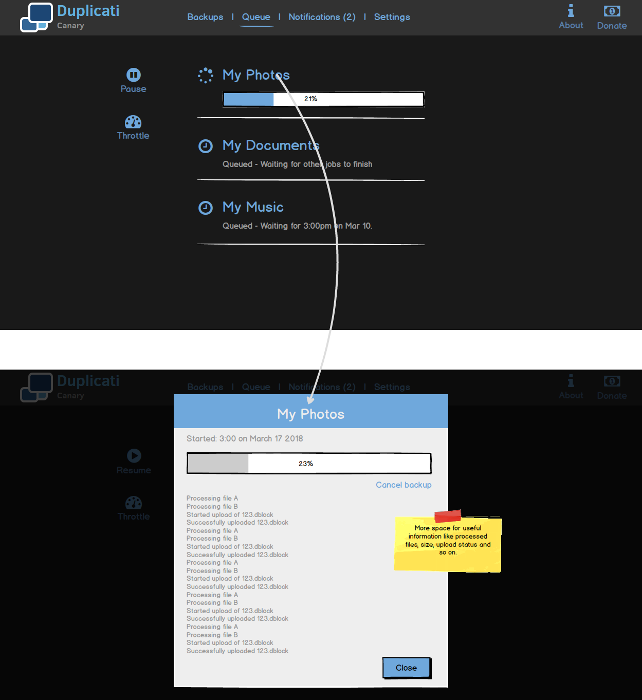
To see when what backup is scheduled, we introduce the queue. The queue not only shows a list of scheduled backups, it also shows the progress of the currently running backup. A click on the progress bar opens a pop-up that provides detailed information about what the backup job is currently doing. Here backups can be paused or the network bandwidth can be throttled.
Notifications
Notifications summarize various kinds of messages. They will show when backups finished (with errors or warning) but they will also show notifications about new updates of Duplicati. The UX is similar to the queue: You can click notifications and a detailed notification message is shown as a pop-up.
Currently, this is just an idea how to address the requests for better progress details and a centralized notification system. Please let us know, what you think!
Neat! As you can see here, I’m in for anything that makes the UI more clean, intuitive and usable.
Your suggestions do not only improve the user interface, but also includes various feature requests. Some confusion that may arise using the current UI can be avoided effectively.
Cheers for the proposed design!
Please let me drop some random thoughts about the new design and how it should behave:
Moved / Replaced components
The menu list in the left column (and 9-dot button in the upper right corner) is replaced by a horizontal oriented menu in the header, correct?
How should this behave in smaller browser windows and on (mobile) devices with a lower resolution? Replacing main menu items (Backups, Queue, Notifications, Settings) with an icon could help here, but I’m not sure if everything will fit if I take a look at this screenshot.
Buttons in left area
Where would they go to on screens with a lower reolution? I guess the “Add backup”, “Restore”, “Pause” and “Throttle” buttons could move to the top of the list (where the search bar is) when there is not enough horizontal space.
Search bar
Is there a particular usecase for a search bar in the Backups menu? I guess a list of 10 backup jobs or more is rare. A few small icons at this locations for various sort options is more useful.
Icons vs Text
The 2 options in the upper right corner (About and Donate) have an icon above the text. Why not doing the same with the main menu items (Backups, Queue, Notifications, Settings)? The Notifications icon could include a small colored dot (white/green/yellow/red) to indicate unread informational/warning/error messages. The number behind Notifications tells how many messages are unread, the color of the dot indicates the severity.
Settings menu*
You did not show an example of how the Settings menu could look like, probably because we’re in an early phase and there is no particular plan of how it should look.
I think the Settings menu could use some extra redesign. In the current implementations, it’s not very easy to find a particular option in the long list of advanced options. Selecting and setting an option could be made easier, something like this: Suggestions for re-design of Advanced Options page
Event Log
The Notification menuj is very nice for ehmm… yes. Notifications. But how will the event log look and where to find it? I guess a link to the logs could be placed in the Notifications menu that will list all events, not only warnings and errors. The log should be presented as a list with one expandable line for each operation. A colored symbol on each line indicates the severity, something like @kenkendk’s suggestion: Feature request: better reporting
You pointed out everything that I thought I could ignore for the time being or that I wasn’t sure about myself. That is why this was great feedback. Thanks.
Re “Icons vs Text”: I would like to have a visual difference between the navigation “Backup, Queue, Notifications, Settings” and the less important stuff like “About, Donate”. Maybe we have to find a different place for the latter.


 That is why this was great feedback. Thanks.