For me, one of the most confusing parts of the user interface is the Advanced options page. The list is becoming too long to find the option you are looking for and a lot of useful options are easily overlooked.
This made me think about how the UI could be improved in a way that all existing settings are available, but are easier to find and have a more user friendly look.
First I have inventoried the backdraws of the current implementation (subjective, I know… ):
The list of Core options is too long
All options are listed alphabetically instead of ordered to functionality.
When creating or editing a backup job, options can be set that do not apply to backups.
In the Restore Wizard, custom options cannot be set al all.
Very basic design.
After thinking it over for some time, I think these suggestions could improve the Settings page:
Create groups that are expandable, based on functionality (Backup operations, Restore operations, Messaging, Logging, etc.)
Combine the current settings in the Settings page with the Advanced settings. This will result in a one level tree where all options can be set (including UI, Update, Donations, Web UI Password settings).
Give all options one or more internal tags, indicating which operations are affected by that option (Backup Restore, Find, Compare, etc). In the Backup Wizard and Restore Wizard only the options should be listed that can affect that operation.
List all advanced options under these groups, not only the options that are set by the user. All Program default options should be listed in grey in the main Settings page. If the user wants to change a specific option, a checkbox could be clicked, which activates the text box, switch or drop-down menu. The value that is given to that option can be displayed in a marked color (preferrable the already used green color).
In the Backup- and Restore Wizard, all settings for that operations should be listed the same way, with one difference: if the user has set a particular option in the main Settings page, that option should be listed in grey in the wizard. Example: the default block size is 100KB. If the user changes this in the main settings screen to 5MB, this 5MB should be listed in grey in the Backup- / Restore wizard.
Slightly modify the options in the UI (for example, remove dashes between words) and remove the short descriptions, that are listed behind the options in the current list.
hovering over an option (or clicking a question mark symbol) should show a popup with help text about that option. The title should be the option name that can be used in the command line.
Order the options by function (not alphabetically).
A radio button to switch to a text box containing the advanced options (just like it is in the current interface).
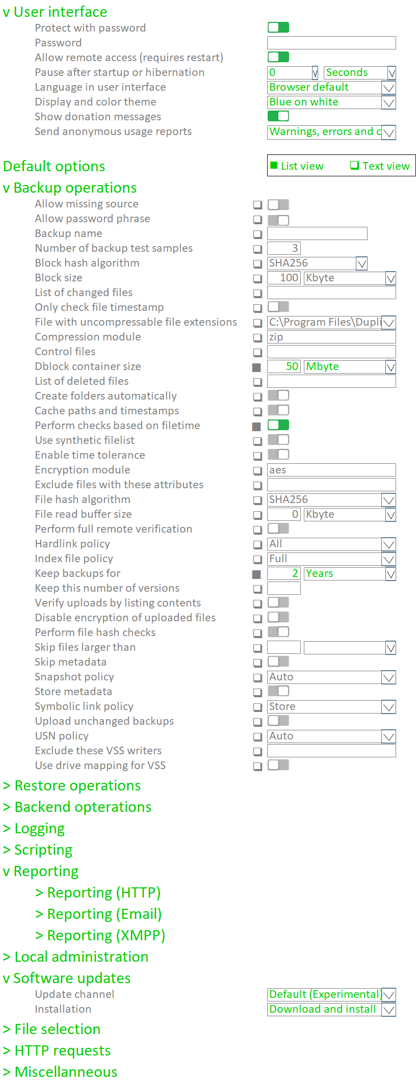
This is an example how the Advanced (General / Common) Settings page could look like (click on the picture to see more):
I have a list of all options that are grouped by function and added some tags to each option. It is far from complete and probably has lots of mistakes, because I don’t know which operations are affected by each option. But I can share it if you like (attachments other than pictures are not allowed here).
Hopefully this contributes a little bit to the user-friendlyness of Duplicati.
Long time ago we decided that advanced options should only be used by people who know what they are doing. That is why we did not make them available in the UI using checkboxes to turn them on/off or input field to specify values. If you do that (checkboxes and input boxes) people will change advanced settings not knowing what they are doing. It is difficult enough to get the main options supported. There are e.g. people who set the block size to 2TB because they think this is the size of their backup drive.
We should indeed try to group advanced options. When we do this, advanced options have to be added one-by-one into the corresponding group. Right now we - IIRC - just automatically generate a list of all options from the source code. So, grouping means maintenance efforts, but we still should do it.
When are what options activated? We currently have our main setting and when you create a backu, you can set specific settings there too. I am not sure what exactly happens and what settings are applied if main settings and backup settings contradict each other. Here we should check what happens and make sure that individual settings always override general settings. Indeed, I have not seen anyone complaining about how it is today
Right now I would not want to offer a nice UI for advanced settings. But maybe we can define a kind of config file that defines groups of advanced settings!? The dropdown then could provide these groups like you proposed and a last group shows everything that has not been sorted yet.
I’d personally vote for a filter text box which, when you enter some arbitrary text, causes the dropdown to filter down to only options containing your text. That would make it a lot faster to hunt for such-and-such advanced option, especially since currently accidentally clicking on the wrong one means having to start all over again.
Thanks for pointing that out! Trying to prevent users to change settings they don’t know the consequences make sense. There are several ways to accomplish this. A few considerations:
Many advanced options are not really “advanced”. For example, e-mail reporting is basic functionality. End users frequently ask how to get it working. This kind of functions should be moved out of the Advanced options list and be made more accessible to end users.
In the Settings page, a group Reporting could be created. A check box could (de)activate the available types of reporting. If a check box is clicked, the user should be able to fill in the coherent settings (SMTP server, Subject etc) and send a test message with the current settings.
Most advanced options are not destructive for your backup jobs, like changing the blocksize of passphrase. Mixing these “dangerous” settings with settings a user really needs (reporting, log file settings or other settings that do not kill a successful completion of a backup), increases support requests (at least, that’s what I would expect). Grouping them and documenenting te consequences of a change would make it more clear if it’s a good idea to change a certain setting.
Making the user interface difficult and user-unfriendly doesn’t sound to me like the best approach to prevent novice users to change these settings. I ugess it’s better to do the opposite:
First, remove options from the list and give them a place in the main settings page and/or backup/restore wizard.
Second, group options by functionality and make it clear to the user what they do (convert commandline option to a well-chosen term with easy to access help text for each option).
Third, make it easy to see which options are modified by the end user (for example by greying out unmodified options).
Fourth, all advanced options that could break a backup operation (not many I guess, things like changing blocksize and passphrase) could be put in a “real” advanced options group, preceeded with a warning that these options are only for advanced users and can have unwanted results.
I think you missed “Fifth, don’t show all advanced options in one 500-item-long dropdown box that you can’t even scroll down through without accidentally picking something by accident 3 out of 4 times”
This thread is about breaking that long list into groups that can be collapsed/expanded, moving out options from the list, adding check boxes that must be selected before an option can be changed, etc. So I guess there’s no need for a fifth.
Which fifth option? The topic is about reducing the long list of unsorted advanced options to a more clear interface with shorter lists. That eliminates @drakar2007’s fifth.
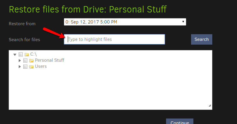
Can you tell where I can find this filter box? I only see a file picker in step 1 and some options regarding overwriting and permissions in step 2. The discussed advanced options are completely absent in the restore wizard! But that’s another issue (submitted an issue at Github some time ago).
Sorry about that kees-z, I should included a winky-face on my comment about the fifth.
And drakar2007 is showing the search box to which I was referring - I think having that sort of highlight (or filter) functionality would aid in looking for individual advanced options.
It’s a bit clunky but certainly works to select an advanced option, read the summary to know if it does what I want, then just “x” it away if it doesn’t.
I do like kees-z’ original design suggestion, but it is a valid point to help protect people from potentially bad option choices - particularly now when dealing with a large group of “frantic” people just trying to find an alternative to what they were used to.
Perhaps adding some indicator regarding the “advanced-ness” of an option to kees-z’ design might help. For example, using an asterisk before (or red text as) the description (along with a footer explaining it) or even prompting users “this is ad advanced feature, please be sure to understand it’s usage before continuing” could help users know “hey, I better pay attention here”.
Didn’t know that, wife usually complains after the first!
I still think it’s better to present all settings some way in a manner that:
the list is grouped and sorted by functionality
user can see in a glance which settings he has changed
The impact of changing the settings should be made clear somehow
With the filter text box, you need to know which settings are available, unless a descent User Manual is available describing all available options.
The example picture above prevents unwanted changes by the user by:
force the user to click a check box before a default option can be changed
highlight all settings that are changed by the user (from grey to green in the example)
Eventually display an extra warning text for settings with a high impact, or grouping this kind of settings in an “Advanced Settings” group.
I agree that avoiding carelessly (de)selecting all sorts of options should be a top priority. But I think that presenting these options in an easy to understand way will help avoiding this. Scrolling through an unorganized list will raise chances of clicking here and there some random options.
Good suggestion! Other option: after categorizing the advanced options in 5-10 groups, another - last - category could be added with the name “Advanced options”. This category could be preceeded with a notable warning text and only contain settings that could destroy/fail existing backup jobs. Viewing through the list of options, I guess not more than 10-15 options need to be included in this group.
The complete list could be renamed to “General settings” or “Common settings”.
This also presents an opportunity to show when a “global” Settings value is being overwritten at the job level (as well as possibly show what the global level setting is).
I rather disagree with your premise - for example I just spent 2 minutes searching for the “max small files” filter on my current computer, because I couldn’t remember A) what letter the command actually starts with, or B) which section it’s contained in. If there were a filter box near the dropdown, I would type “max” into it, and the dropdown would temporarily only display any entries with “max” in their names (they could still be ordered and categorized the same - obviously the only categories shown would be the ones with a valid search result).
I don’t see how this has any impact as far as “user can see in a glance which settings he has changed” – the changed options would continue to show up below the dropdown selector in a manner exactly like they currently do.
Given that the “Add advanced option” appears to be be a standard / static HTML Select field it should be fairly easy to implement a “standard” filter feature for it as is giving us time to evaluate much larger UX canges with minimal “throw away” code.
I actually came here for this very thing It’s not a filter - but a highlighter. You still need to drill down to find the file you’ve highlighted. A Filter with output that shows all the files that match it would be super
 ):
):