I’ve been using the new GUI and I quite like it. But, I’ve found a couple of quirks.
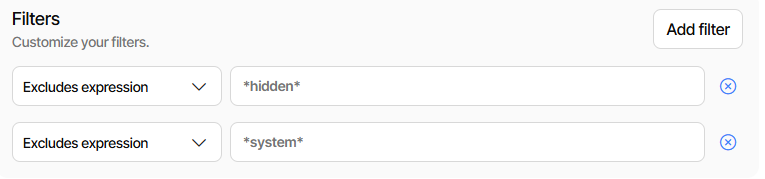
If I edit an existing backup set that already has a lot of filters, if I try and add a filter it doesn’t appear as it seems it’s off the bottom of the list and I’m not sure how to scroll to it.
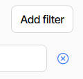
Also, in the old GUI, if you go into the command line of a backup set, it’s quite easy to remove all existing filters. In the new GUI, it seems to be missing the “X” to easily remove them.
My list (Chrome on Windows) seems to allow 18 regardless of window size or source Paths.
Does yours look similar? I do see the close buttons. What browser and OS is lacking below?
If I edit a backup job, I get the same as you. A list of 18. If I try and add, I can’t see it as it’s off the bottom of the list. I do have the close button here. I actually have more than 18 entries, and it’s impossible to see them unless others are deleted.
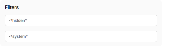
If I go into “Commandline” for a job, there is no option to delete the filters as the close button is missing here.
One thing that’s somewhat nice (for some) is it gives “raw” view instead of GUI interpretation.
The old UI does the same, but also gives an x button to delete it (but not permanently) easily.
Maybe the developers will have some comment on the change, meanwhile, I’m fretting over Settings default options not being seen, but I’ll open separate issue on ngclient if confirmed.
I’ve run into this issue as well. My existing backup jobs have 200+ filters each, and yet I can only see the first 18 if I go to edit them using the new UI (and I can’t add any new ones).
Same issue here. The “filters” card seems to display up to 18 entries, and if there is a 19th or later entry it’s hidden behind the “exclude” card with no way to access it. Related, clicking the “Add filter” button adds a filter as a child app-new-filter object to the bottom of the list, inaccessible via the UI.
One fix would be to make the app-toggle-card object scrollable?
The Filters display under commandline has the same issue - display limited to 18, no scroll
Source filter display has limit – some say 18, some say 10 #407
was filed based on forum posts and has gotten further postings.
One suggested using tab, e.g. from the last field you can get to.
Quite clunky (multiple tabs), but for me it’s the ugly workaround.
EDIT 1:
Workaround to avoid pressing tab four times to move 1 field is to
hold key down, assuming you have an input that can autorepeat.
Similar with shift-tab gets back up, but there are also other ways.