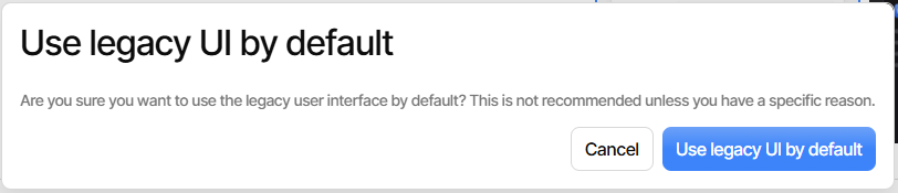
Much nicer now, although seemingly constrained by the UI buttons only being in new UI, meaning getting back to new UI default needs temporary to get Settings, then click the button (which could easily be mistaken for an a report) to change it.
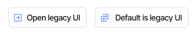
Left button clearly offers an action. Right button isn’t clear, but does do a toggle, which perhaps is what the right-and-left arrow icon means, but it’s kind of vague.
If one takes a guess that the right message is a clickable button, things get clear:
Although I’m not a UX designer, I think button label is usually action not status.
To me, “choose the default theme” is not “Default is X UI” but “Default to X UI”.