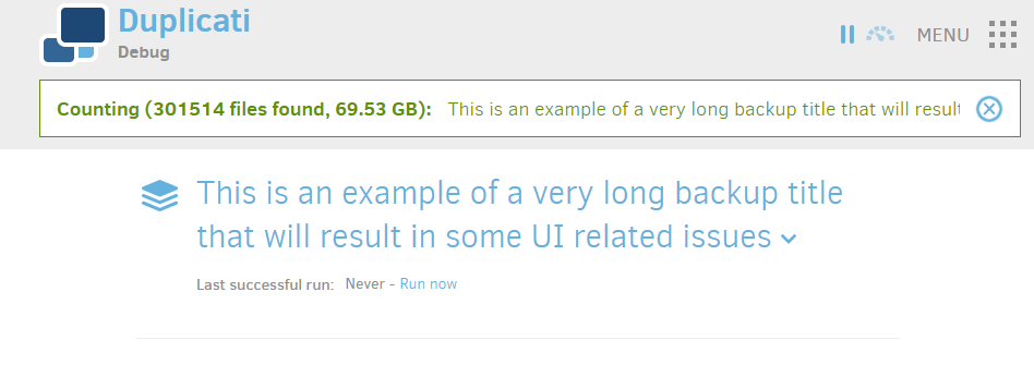
I don’t think it will make much difference: when using long backup names, the name will be truncated anyway if the status bar has limited or a fixed horizontal space:
It’s impossible to fit everyone’s needs when designing a UI: some people would like to see the complete backup name if possible (your preference), others want to add additional info like transfer speed, resulting in less space for the backup name.
Dynamic icons for the backup job list partially resolves this problem: you can easily identify which backup job is currently running by browsing the list. See issue 3129.