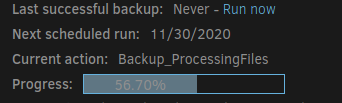
When using the dark them, the font in the small progress bar is difficult to read. In that theme it would be better if it were a dark color font rather than the current light color (give it contrast to be seen).
When using the dark them, the font in the small progress bar is difficult to read. In that theme it would be better if it were a dark color font rather than the current light color (give it contrast to be seen).