Hi
Why do we have such a huge usage drop in https://usage-reporter.duplicati.com/ whatever the range and nearly any feature we select?
Have a nice day
The “most recent” period is always lagging a bit.
For instance, if you choose by month, this month is only half-done, so the stats for this month will be much lower than the previous month. Same for week, etc.
So the trend always shows dropping ?
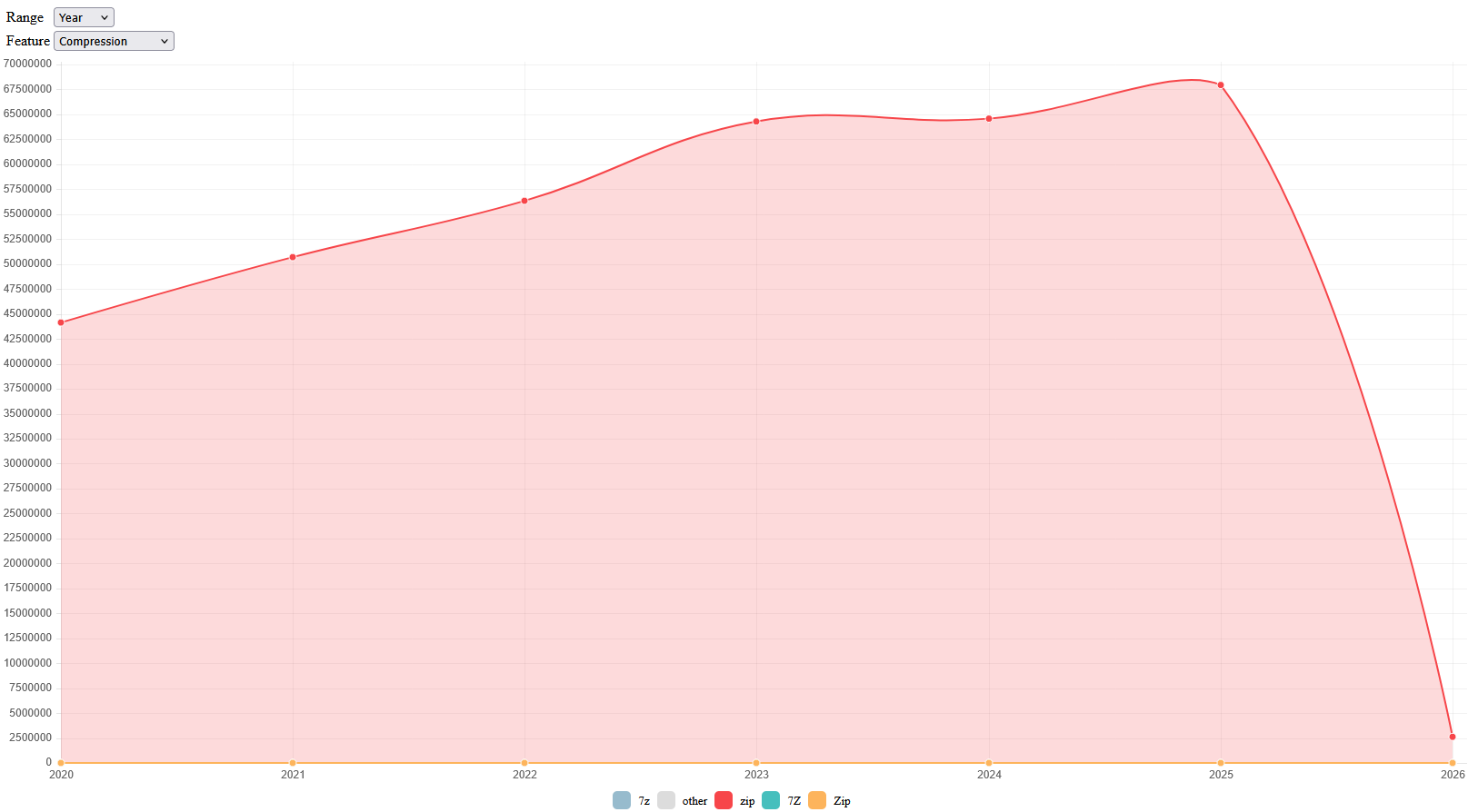
so clearly not. The point the dev made is that the dot for 2026 is low. 2026 is new.
Hover over the dot for actual count. Very little time in a period means lower count.
From what I can tell, the dots are the values, so curve between is not a measure, but just software-drawn curve which is only a visual aid trying to show in between.
2026 is not finished (by a long shot), measure is low, software draws curve down.
2026 would still be low If this was a bar graph, as the counts for 2026 aren’t done.
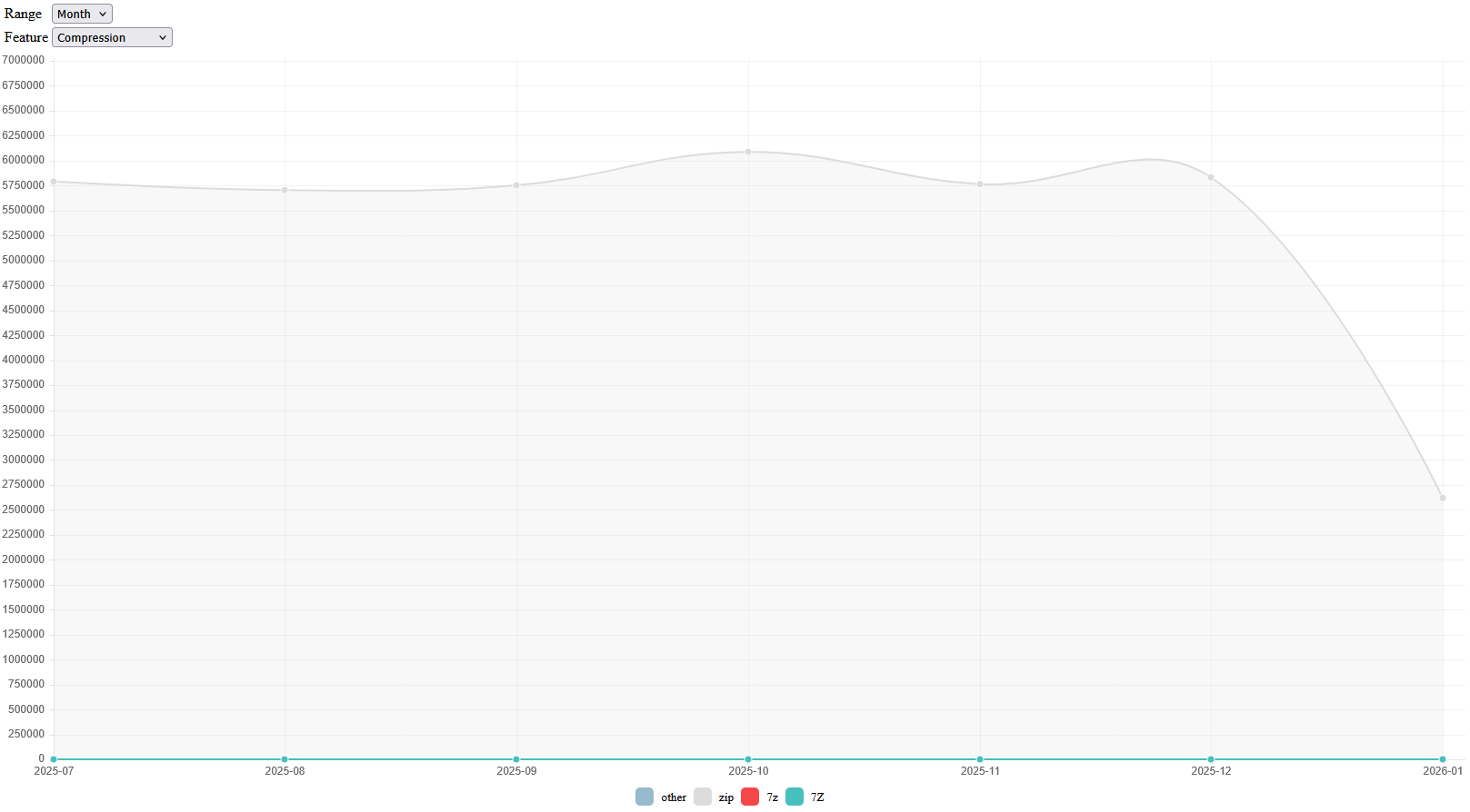
Zoomed in to monthly looks pretty flat except for expected drop for partial January, which actually looks a little less than half. Maybe submission and processing delay because zooming in even more shows recent low counts. Try looking at those later.
What I see is steady usage growth over many years – and no huge usage drop.
Displaying Missing Values and Incomplete Periods in Time Series
came up, but I don’t know if graphing software can offer any better visualization.
My question to Google also gave an AI overview. You can try this in your search:
how to read graph with incomplete last period
No, but if last count drops due to counting partial period, that causes curve drop between the last full period and the almost-certainly lower partial. It’s not a trend because a trend comparing years needs to compare full years, like in first graph between 2020 (presumably a full year) and 2025. 2026 isn’t a full year count yet.
Sorry I just read the slope of the graph as a drop - I didn’t realise that last points are partial. Maybe a correction of the last point, e.g. like yearly-cumulative-collected-Compression on january 15 16PM = 2,500,000 may be corrected as 2,500,000/(15*24+16)*365.25*24 = 58,284,574 or any pertinent precision, with a notice stating this correction as a legend of the graph. This would show any change in the trend from past.
What ever, don’t worry for me, I’m glad with your explanations.
That entire site really needs a full makeover, including some thoughts on how to present the data.