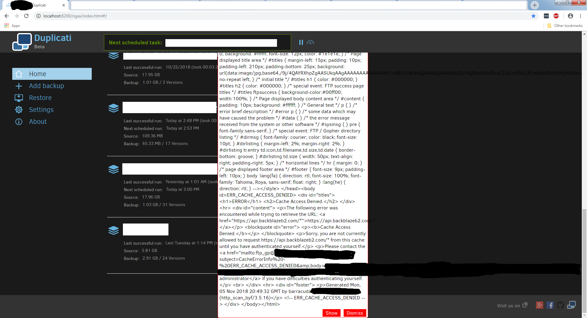
It seems recently my IT department has enacted some new network policies that are causing my duplicati > backblazeB2 backup job to fail. I’m having a problem with the ‘Hey, your job failed’ popup (sorry, not sure what the correct term is, the thing with Show/Dismiss options that displays on the Duplicati home page when a job fails.)
The Problem
- It consists of the html response from our network monitor, which is a huge chunk of text (flies past the top of my browser window.)
and
- I can’t scroll that box to read the entire message.
Currently the only way to deal with it is to click/drag to highlight the message and, because I can’t see the start of the message, some of the bottom of the Duplicati home page to make sure I got everything. After that I paste it into an editor, manually remove the tail end of the home page, and save as an html doc so I can see what the actual problem is.
Feature Request
Would it be possible to
-
Make that error notification scrollable or
-
Add logic to return a ‘Check out this job’s logs, something went wrong.’-type message if the error returned is more than X characters/lines long?
I’m having trouble picturing what you’re running into.
Would it be possible to paste a screenshot here? (Note that you can simply copy an image to your clipboard and paste it directly into your post).
Perfect - thanks!
That’s the error/warning modal - and normally it is only supposed to display one or two lines of text, so even if there’s something else going on with your corporate network I don’t see how it would be causing what you’re seeing…
My guess is there’s some firewall software or a browser plugin or of some sort that is munging the results of the normal Duplicati tray-icon <-> Duplicati-service commnications.
If you click the “Show” button does it take to the job Log page? If so, you may find the error information also available there (be sure to click on the line with the time stamp to expand it). Alternatively, it might be in the global log (http://localhost:8200/ngax/index.html#/log).
All that being said, it’s still VERY odd that you’re seeing that - I’ve never seen anything like it and I’m guessing others (like @Pectojin or @kenkendk) have either.
Oh - what version of Duplicati are you running, on what OS, and in what browser?
If you click the “Show” button does it take to the job Log page?
Yes, that functions great. I completely forgot that I could find the info there.
Oh - what version of Duplicati are you running, on what OS, and in what browser?
Sorry, should’ve known to include that from the get.
Duplicati - 2.0.3.3_beta_2018-04-02
Windows 7 Pro sp1
Chrome (70.0.3538.77 (Official Build) (64-bit))
I usually use Chrome but just confirmed the same output on Firefox (both 63.0 (64-bit) and 63.0.1 (64-bit)) on my machine.
Thanks for the info!
Unless I hear otherwise I’m assuming your immediate need of “how do I read this huge error message?!?!” is resolved and we’ll add the “how did this huge error message come to exist in the first place” to our to-do list. 
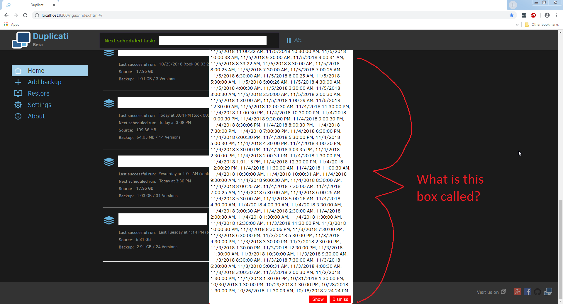
Just wanted to chime in with a “me too” w.r.t. getting a massive, off-screen error/warning modal due to the DST duplicate backups bug.
I think that @molecular_eskimo’s suggestion to automatically make the modal use a scroll bar if it goes off screen is a good one, because while the box is “only supposed to display one or two lines of text,” it’s clearly possible for it to display many more, and making it scrollable is a much more defensive design than hoping that everything upstream conforms to the design doc and will never send so much text that it vertically overflows the window.
Being able to support scrolling makes sense to me.
I’m curious though, if you reduce the browser zoom level (usually ctrl-minus) does it help for fitting more text into the window?
I’m curious though, if you reduce the browser zoom level (usually ctrl-minus) does it help for fitting more text into the window?
Sure does. I can see the entire message at 80% zoom and below.
Thanks! Now I see what’s going on.
The error message about having duplicate timestamps (caused by a DST timeshift related bug) includes the ENTIRE list of timestamps, not just the duplicate ones.
So I think we’ve got two things to fix:
- add scrollbars to UI message window
- update that message to not include EVERY version timestamp as that could eventually get big enough to overflow the log fields.